Styling
How to apply your own CSS to mounted SDK screens and components.
Background
Solvimon components render inside shadow DOM. CSS from the host page cannot reach into that shadow DOM, so a stylesheet on your page has no effect on SDK output. To style SDK content, pass your overrides through the SDK configuration instead.
How it works
Pass a cssOverrides value to createSolvimonCore. The SDK injects those rules into each mounted instance’s shadow root as a <style data-solvimon-css-overrides> element, so they apply everywhere you mount a screen or component.
cssOverrides restyles the appearance of existing elements. It can’t add, remove, or reorder them, and it can’t change layout structure.
Write your overrides as plain CSS targeting the public sv-* classes, then pass that string as the cssOverrides option:
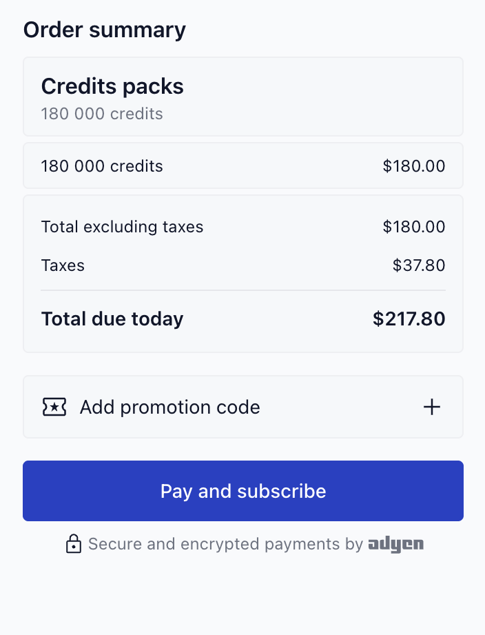
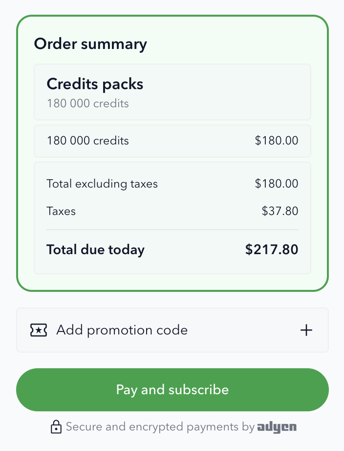
Those overrides change the font, restyle the checkout submit button, and reframe the order summary:
Your rules land in a <style data-solvimon-css-overrides> element inside each shadow root. If an override isn’t taking effect, that’s the first place to look in devtools: expand the SDK element’s shadow root and confirm your CSS is present and well-formed.
cssOverrides also accepts an array of CSS strings, which the SDK joins automatically.
!important
The SDK’s styles come from Tailwind utility classes set directly on the elements. When one of those already sets a property you’re overriding, your rule loses the cascade and has no effect; !important makes it win.
Rather than work out in advance which properties Tailwind already sets, let devtools tell you. Write the rule without !important, inspect the element, and add !important only to the properties that show up struck through. In the example above, the button needs it (Tailwind sets its background, text color, and radius); the order summary doesn’t.
Styling hooks
Target the public sv-* classes. Do not rely on internal Tailwind utility classes; they are implementation details and can change between releases.
All sv-* classes are part of the public styling surface and are stable across releases. If a class exists in the shadow root and starts with sv-, you can target it. The table below lists the common hooks; any additional sv-* classes you find in DevTools carry the same stability guarantee.
For example, the checkout screen maps to these hooks:
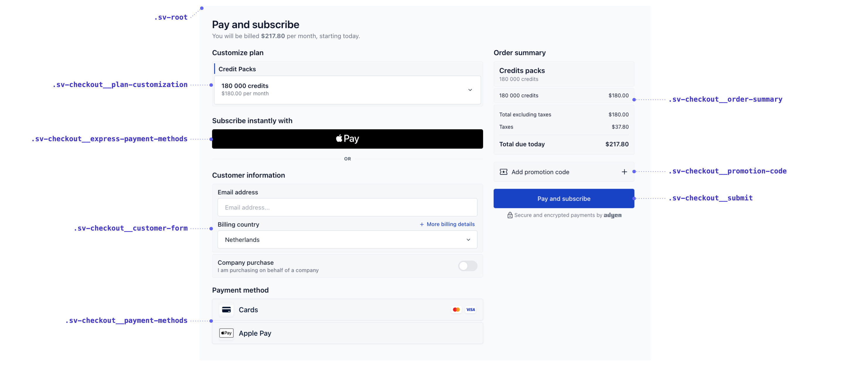
This table lists the common hooks, not every class. To find additional hooks, open your browser devtools and inspect the rendered SDK content inside its shadow root; any sv-* class is a valid target.
Classes follow a BEM naming convention: sv-block__element--modifier. Modifiers let you target specific states and variants, such as .sv-checkout--paid, .sv-error, or .sv-action--primary. Only the sv-* classes are part of the public styling surface; treat anything else you see in the shadow root as internal.
For brand colours, prefer the branding.colors options on Core. Use cssOverrides for finer-grained styling that those options don’t cover.